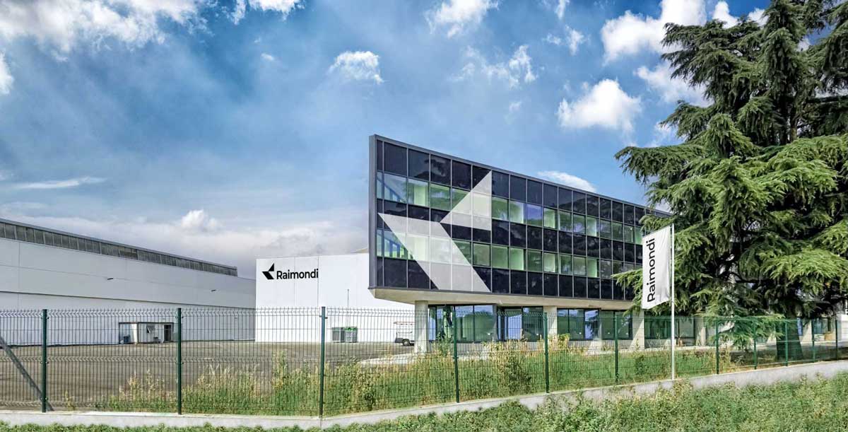

Raimondi Cranes unveils new brand and company vision
Equipment

Raimondi Cranes unveils new brand and company vision

Raimondi Cranes SpA, heritage manufacturer of intelligently designed machinery, unveiled a new corporate identity and vision for the global construction audience.

“We are delighted to present a new visual identity for Raimondi Cranes, one that builds on its long heritage within the global construction industry. For the past two years we have been working on reshaping our vision with heavy investments into a new manufacturing facility, and by allocating substantial resources to our R&D department,” said Eng. Diego Borgna, CEO, Raimondi Cranes.

Spanning almost 160 years of manufacturing history and business activity, Raimondi’s passion and knowledge fortifies its reputation for developing quality products that resonate with client needs—a customer-centric approach has always been one of Raimondi’s key characteristics.

Building on this enduring value proposition, the company has invested extensive resources into two core areas of business: a new production facility implementing lean-manufacturing innovative techniques, and the development of 14 new flattops that have been optimised according to customer feedback.

“The strategic decision to rebrand echoes recent innovations and encapsulates the company’s embraced vision of being the most responsive global leader in scalable heavy lifting solutions,” continued Eng. Borgna.

The overhaul of the company’s visual identity, a process that occurred over 16 months, represents a milestone for Raimondi as it is the company’s first full rebranding in decades. The renewed look and feel is confident, dynamic, and contemporary.

The new logo pays homage to Raimondi’s legacy by placing focus on one of its strongest design elements, the ‘R’ icon, while simplifying and modernising it to signify efficiency and innovation. Raimondi’s signature shade of red has been replaced with a monochrome schema, conveying the company’s modernised approach. Touches of the heritage red will still be implemented on .

Raimondi’s products—the core of its business—symbolic of the idea that past and present can coexist in growth.

“Retaining Raimondi’s heritage and values was a top priority. The new branding reflects our evolving positioning and growing market ambitions with the aim of raising expectations. We will use it to drive expansion into new markets together with a series of new products, services, and solutions,” he concluded.

The rebrand will be rolled out over the next two weeks following the launch of Raimondi’s refreshed website. The official unveiling of the brand will take place at Bauma from October 24-30, 2022, in Munich, Germany.

Raimondi Cranes SpA, heritage manufacturer of intelligently designed machinery, unveiled a new corporate identity and vision for the global construction audience. “We are delighted to present a new visual identity for Raimondi Cranes, one that builds on its long heritage within the global construction industry. For the past two years we have been working on reshaping our vision with heavy investments into a new manufacturing facility, and by allocating substantial resources to our R&D department,” said Eng. Diego Borgna, CEO, Raimondi Cranes. Spanning almost 160 years of manufacturing history and business activity, Raimondi’s passion and knowledge fortifies its reputation for developing quality products that resonate with client needs—a customer-centric approach has always been one of Raimondi’s key characteristics. Building on this enduring value proposition, the company has invested extensive resources into two core areas of business: a new production facility implementing lean-manufacturing innovative techniques, and the development of 14 new flattops that have been optimised according to customer feedback. “The strategic decision to rebrand echoes recent innovations and encapsulates the company’s embraced vision of being the most responsive global leader in scalable heavy lifting solutions,” continued Eng. Borgna. The overhaul of the company’s visual identity, a process that occurred over 16 months, represents a milestone for Raimondi as it is the company’s first full rebranding in decades. The renewed look and feel is confident, dynamic, and contemporary. The new logo pays homage to Raimondi’s legacy by placing focus on one of its strongest design elements, the ‘R’ icon, while simplifying and modernising it to signify efficiency and innovation. Raimondi’s signature shade of red has been replaced with a monochrome schema, conveying the company’s modernised approach. Touches of the heritage red will still be implemented on . Raimondi’s products—the core of its business—symbolic of the idea that past and present can coexist in growth. “Retaining Raimondi’s heritage and values was a top priority. The new branding reflects our evolving positioning and growing market ambitions with the aim of raising expectations. We will use it to drive expansion into new markets together with a series of new products, services, and solutions,” he concluded. The rebrand will be rolled out over the next two weeks following the launch of Raimondi’s refreshed website. The official unveiling of the brand will take place at Bauma from October 24-30, 2022, in Munich, Germany.

Next Story
Technology

We’re building robots that flow, not just move

Founded in 2021, Flo Mobility is reimagining construction automation with vision-AI robots designed for seamless movement through complex sites. In conversation with CW, Manesh Jain, Founder & CEO, discusses the company’s origin, its LiDAR-free tech stack, and expansion plans in the Middle East and US.What inspired the name Flo Mobility? Why ‘Flo’ and not ‘Flow’?When we started the company in 2021, our focus was on building autonomous navigation systems for robots. Since our work centred around robot movement, ‘mobility’ naturally became part of the name. We wanted to co..

Next Story
Real Estate

We’re committed to setting benchmarks in sustainable luxury living

From a landmark land acquisition in Boisar to ambitious launches across the Mumbai Metropolitan Region (MMR), National Capital Region (NCR), Bengaluru and Pune, Birla Estates is driving future-ready growth with a strong focus on sustainability, partnerships and premium living, firmly anchored in its LifeDesigned® philosophy. K T Jithendran, Managing Director & CEO, outlines the company’s premium, sustainable growth playbook in conversation with PRATAP PADODE, Editor-in-Chief, CW. Excerpts:Birla Estates recently acquired a 70.92-acre land parcel in Boisar, Maharashtra, for..

Next Story
Infrastructure Urban

Mumbai’s land crunch and ageing homes call for structured renewal

Founded in 2022, Etonhurst Capital Partners is a real-estate fund management platform focused on the Indian market. As the firm achieves the first close of Rs 1.8 billion for its debut Rs 5 billion fund, Bamasish Paul, Co-founder, Managing Partner & CEO, discusses its sharp focus on redevelopment-driven value creation in Mumbai’s urban core with CW. Excerpts:Etonhurst Capital has achieved a significant milestone with the first close of Rs 1.8 billion for its Rs 5 billion fund. What factors contributed to this early success and how do you plan to attract further investments to r..

Advertisement

Advertisement

Subscribe to Our Newsletter

Get daily newsletters around different themes from Construction world.

STAY CONNECTED

Advertisement

Advertisement

Advertisement

Advertisement

Talk to us?