How to choose a colour palette for your home
Creating a personalised colour scheme
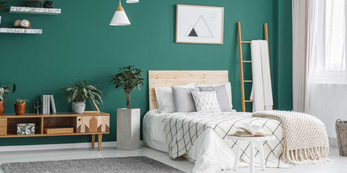
The colour wheel made of primary, secondary and tertiary colours can help create a personalised palette for your home. Choice among the various hues and shades can be a daunting task. “One of the main tips would be to take cue from the personality of the home owner. The space should create an experience suited to the end user” says Poddar.A great tip that most designers give is to ask the question, ‘which colours do you love?’. Colours evoke emotions and choosing those that are close to the liking of the owner, weaken the odds of them growing bored of it. “Colours form an integral part in my design process from the initiation stage itself. While executing residential interiors catering to the end user’s colour preferences becomes my baseline for design development. At each stage of the project a detailed dialogue is struck with the family which helps us narrow down on their colour palette preferences” says Gauri Karnani, Founder of A+G Architecture and Project Management.
Colour schemes are mostly created in four possible ways:
- Monochromatic: The monochromatic color scheme uses tone on tone of the same color with the addition of white or black to lighten or darken the color.
- Analogous: The monochromatic color scheme uses tone on tone of the same color with the addition of white or black to lighten or darken the color.
- Contrast: The contrast scheme is more dramatic. Here a triad of contrasting colors is used, such as yellow-orange, green-blue and red-purple. This introduces more color and energy into one’s home palette.
- Complementary: In the complementary scheme, two opposing colors, such as blue and orange, are used together to create a dramatic, bold and high energy color scheme.
“When it comes to residential projects, I intend to choose earthy colour palette as we strive to contain nature in our layout with rustic tones of interiors. We try and hold it raw by creating our personal colour tones” says Paritosh Bajaj, Principal Architect at Studio Sabhsai.
Things to consider while choosing a colour palette

“To my opinion an explicit colour palette should not only enhance the well-crafted interiors of the residence but should also closely compliment the family’s general routine and overall lifestyle. Every design goes through several stages of preparing mood boards, accurately mapping textures and also iterations of 3D renderings to reach client satisfaction. Accurate hues in a personal space always help to achieve the desired warmth that every individual longs for in their home. The desired result to meet the family’s satisfaction is gracefully achieved using a distinct combination of finishes comprising of veneers, wall papers, graphics, upholstery etc.” says Karnani.
Flow of the colour tones
Wall paints are a fairly permanent job and changing them frequently can comes with its own hassles. For this purpose, it is best to get sample size paints in your choice of colours and paint a small area. Take a look around the home and see how this sample paint flows and looks with the other rooms of the house. A colour that complements other rooms of the home makes it look aesthetically appealing. An adjoining room may want a nonaccent or a neutral color, or conversely, you can work with contrasting tones as well as long as there is always a semblance of flow.According to Poddar, “The colours you choose do not always have to match, but should rather complement one another. While each space can look and feel distinct, it is important to create a cohesive connection by using complementary colors. Choosing colors that have the same temperature (i.e., are all warm colors or are all cool colors) will usually flow well. Warm colours like orange, red, yellow are associated with heightened emotions and passion as well as joy and playfulness while cool colors like blue, green make you feel calm, relaxed, and refreshed.”
“An accent or feature wall in a shade that is warmer or cooler than your main color can add some drama. One can also match the wall color to a color in your favorite piece of artwork or other home accent”, she adds.
Lighting of the space
A colour can be seen its full potential in daylight. It changes looks as the day or seasons progress. When choosing your palette, ensure you check them out in the day. A play of shadows and well lit areas play an important role in how the walls, décor and furniture appear. Once those elements are decided, choosing colours becomes and easier play.Understanding your fixed elements
The fixed elements of your home automatically take a place in the colour scheme that you would go for. Things like flooring (wooden, tile or marble), countertops or cabinets play a large role in decision making of the colours that would follow in the house.While most of these elements can be in neutral tones, their undertones can impact how other colours contrast or complement the space. Be sure to keep a keen eye on this factor and you’re your choice.
Commitment to colour

Individuals and families together have their favourite colours, choices and personality. Choosing those colours that resonate with you and those who live in the house keeps you committed to those for a longer duration. They also infuse a positive energy to the space.
A palette for your home is a personal choice based on your personality and style. Bold, neutral or a mix of both, the possibilities are endless and combinations are innumerable. Choose a flow for your home, shades that please your eyes and make your home a beautiful space and reflection of yourself.

Pecan Realty Completes Rs 1.5 Billion Transactions
Pecan Realty has recently completed four institutional transactions worth over Rs 1.5 billion over the past two years, strengthening its position as an execution-led real estate platform. The deals include resolution-led acquisitions, structured finance transactions and capital partnerships across its development portfolio.The transactions covered acquisitions through the National Company Law Tribunal process and helped provide repayment or exits to both private and public sector lenders. The company said the deals demonstrate its ability to resolve complex project situations, work with instit..
SNN Estates Expands North Bengaluru Housing Project
SNN Estates has announced an expansion of its SNN Estates Felicity residential project in North Bengaluru following strong buyer demand, with 75 per cent of the first-phase inventory sold within three days of launch.The developer will add 76 apartments in the new phase, taking the project's estimated revenue potential to around Rs 1,000 crore upon completion of Phase 2.Spread across 6.5 acres in Rachenahalli, near Manyata Tech Park, the project comprises 604 apartments in 1.5, 2, 2.5, 3 and 4 BHK configurations. The development includes a 50,000-sq-ft clubhouse with amenities such as sports co..

SCG Drives ASEAN Industrial Transformation Strategy
SCG is strengthening its focus on ASEAN as a key growth region by advancing industrial transformation, enhancing competitiveness and building resilient regional value chains. Thammasak Sethaudom, President and Chief Executive Officer, SCG, highlighted the need for industries to continuously develop capabilities, strengthen resilience and deepen regional cooperation to achieve sustainable long-term growth.SCG views ASEAN as an important growth engine alongside China, supported by favourable demographics, trade connectivity and investment flows. With ASEAN’s GDP projected to grow by around 4.7..
Latest Updates