WAREHOUSING & LOGISTICS

"Ecom Express unveils new brand identity "

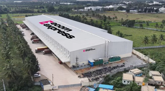
"Ecom Express, India’s only pure-play B2C e-commerce logistics solutions provider as of the Financial Year 2024 operating a pan-India express logistics network, has unveiled a new brand identity. This transformation reflects the company’s conscious commitment to being customer-focused, including addressing specific customer category needs, a focus on customer-facing metrics and key result areas, and seamlessly integrating innovative technology across its pan-India express logistics network, achieving speed, agility along with the widest levels of network reach, to deliver a customer-focused approach.

This rebranding initiative features a vibrant, forward-thinking logo and a refreshed visual identity that symbolizes Ecom Express’s pursuit of excellence. The new logo, with its forward-moving arrow enclosed within a square, embodies the company’s commitment to deliver. The ingenious integration of the letter ""E"" stands for Expression, Innovation, and Progress, while the bold magenta color embodies the spirit of bravery, self-expression, and unyielding strength—. Ecom Express is reintroducing itself with a new identity and a vibrant color—Magenta. This rebranding represents a renewed commitment to their customers, partners, and team. Ecom Express is determined to simplify and democratize logistics for everyone, everywhere,.

Elaborating on the vision behind the transformation, Ajay Chitkara, CEO and MD of Ecom Express, said, “Ecom Express has consistently earned the trust and admiration of our partners, patrons, and customers. As we advance to greater heights, our refreshed brand identity signifies a reaffirmation of our customer-first approach. We are committed to integrating robust technology and innovation to deliver reliable, high-speed services with the widest network reach, all while optimizing operational efficiency and flexibility. He added, “This transformation also strengthens our commitment to our employees and delivery partners, who are fundamental to our business. Our new identity is a testament to our promise of excellence and dedication to redefining logistics through advanced technology aimed at making life easier for all types of customers.”

Ecom Express's new logo is a symbol of its commitment to core values. Each element of the logo embodies Ecom Express's focus on enhancing customer welfare,  and fostering a diverse and inclusive environment."

Ecom Express, India’s only pure-play B2C e-commerce logistics solutions provider as of the Financial Year 2024 operating a pan-India express logistics network, has unveiled a new brand identity. This transformation reflects the company’s conscious commitment to being customer-focused, including addressing specific customer category needs, a focus on customer-facing metrics and key result areas, and seamlessly integrating innovative technology across its pan-India express logistics network, achieving speed, agility along with the widest levels of network reach, to deliver a customer-focused approach.This rebranding initiative features a vibrant, forward-thinking logo and a refreshed visual identity that symbolizes Ecom Express’s pursuit of excellence. The new logo, with its forward-moving arrow enclosed within a square, embodies the company’s commitment to deliver. The ingenious integration of the letter E stands for Expression, Innovation, and Progress, while the bold magenta color embodies the spirit of bravery, self-expression, and unyielding strength—. Ecom Express is reintroducing itself with a new identity and a vibrant color—Magenta. This rebranding represents a renewed commitment to their customers, partners, and team. Ecom Express is determined to simplify and democratize logistics for everyone, everywhere,.Elaborating on the vision behind the transformation, Ajay Chitkara, CEO and MD of Ecom Express, said, “Ecom Express has consistently earned the trust and admiration of our partners, patrons, and customers. As we advance to greater heights, our refreshed brand identity signifies a reaffirmation of our customer-first approach. We are committed to integrating robust technology and innovation to deliver reliable, high-speed services with the widest network reach, all while optimizing operational efficiency and flexibility. He added, “This transformation also strengthens our commitment to our employees and delivery partners, who are fundamental to our business. Our new identity is a testament to our promise of excellence and dedication to redefining logistics through advanced technology aimed at making life easier for all types of customers.”Ecom Express's new logo is a symbol of its commitment to core values. Each element of the logo embodies Ecom Express's focus on enhancing customer welfare,  and fostering a diverse and inclusive environment.

Next Story
Resources

Ajmera Realty launches tree drive on Environment Day

Ajmera Realty & Infra India marked World Environment Day with a large-scale tree plantation initiative—Plant-with-Purpose—across its projects in Mumbai and Bangalore. The drive was inaugurated at Ajmera Manhattan and Ajmera Greenfinity in Wadala, with senior company officials and residents in attendance. The campaign encourages residents to embrace eco-conscious, self-reliant lifestyles by growing useful plants and trees within their communities. Horticulture expert Devendra Bhekar guided residents on creating and maintaining green spaces. Ajmera Realty planted over 500 trees..

Next Story
Resources

Twaron®-reinforced tyre powers Brunel’s solar race car

Teijin Aramid’s Twaron® with circular content will debut in Bridgestone’s race tyres for the 2025 Bridgestone World Solar Challenge, supporting the Brunel Solar Team’s Nuna 13 car. This marks the first use of the recycled-content aramid in a high-performance race tyre. The Twaron®-reinforced belts help enhance durability, reduce rolling resistance, and maintain lightweight strength—critical for the 3,000-km solar race across Australia. Bridgestone combines this with ENLITENTM tech and other recycled inputs to maximise environmental and performance outcomes. Teijin Aramid, a..

Next Story
Building Material

Kamdhenu Paints launches new wood coating range

Kamdhenu Paints has launched a comprehensive premium wood coating range designed for both interior and exterior applications. The collection includes high-performance solutions like Kamwood 2K PU for a rich matt or high-gloss finish, Kamwood 1K PU for clarity and stain protection, and the Kamwood Melamyne system for a smooth, durable finish. Also featured are Kamwood Wood Stains, which enhance wood grains with vibrant colour, and NC Sanding Sealer for high-build grain filling. The range is supported by Kamwood Thinners for ease of application and optimal finish. Saurabh Agarwal, MD, ..

Advertisement

Advertisement

Subscribe to Our Newsletter

Get daily newsletters around different themes from Construction world.

STAY CONNECTED

Advertisement

Advertisement

Advertisement

Advertisement

Talk to us?